Implement container that gives additional information on the profile setting#4222
Conversation
fa4c413 to
24eb3f5
Compare
Codecov ReportBase: 88.44% // Head: 88.48% // Increases project coverage by
Additional details and impacted files@@ Coverage Diff @@
## main #4222 +/- ##
==========================================
+ Coverage 88.44% 88.48% +0.03%
==========================================
Files 282 282
Lines 24858 24850 -8
Branches 6660 6656 -4
==========================================
+ Hits 21986 21988 +2
+ Misses 2667 2660 -7
+ Partials 205 202 -3
Help us with your feedback. Take ten seconds to tell us how you rate us. Have a feature suggestion? Share it here. ☔ View full report at Codecov. |
 canova
left a comment
canova
left a comment
There was a problem hiding this comment.
For the profile data format:
I still have doubts about using MarkerFormatType on other places but maybe in the future we can make this more generic across profile. So I'm not opposed to it.
For the UI:
Is there a need for a new overlaying popup exactly? I'm surprised by this because I was always thinking that we can use the same popup and never though of another poup. Adding another popup brings accesibility issues like, how to close, how to go back to previous popup and confusion of opening another overlay from an overlay etc.
I was thinking about expanding the same "profile info" popup with additional information when user clicks on this button. There are <details> and <summary> elements you can use for this as well. This also removes a lot of extra css and code from the PR.
What do you think?
Which popup? The current "Profile info" popup is pretty narrow and small. The popup can be opened and closed the same way as the "Profile info" popup. I would like to present lots of information in this popup. Like all currently running processes on the host system, all environment variables (might have fairly long names), all used libraries. The CSS (and code) is mostly copied from the existing "Profile info" popup. |
|
Do you have an example where this width is not enough for your use case? Since you are moving the value to a new line, you will have more space horizontally. In your current example, it looks like they would all fit. The problem with the new popup is that it's not obvious that which element it is tied to. For the profile info popup it's obvious that it's tied to "Profile Info" button: But opening a popup from another popup doesn't seem right UX wise. I also don't think we should use the same modal for this case though. |
You're probably right. I currently don't have a case at hand where expanding the current popup to the bottom, and adding scrollbars would not help. Another idea: Could we extend the "Profile info" to the right? This would alleviate all my width concerns. |
I'm not opposed to it as long as it doesn't make our other side by side key-value items hard to read. Could be good to get feedback from others too. |
|
|
892759b to
da3298e
Compare
 julienw
left a comment
julienw
left a comment
There was a problem hiding this comment.
Thanks for the patch, and for your patience!
I left a few comments, tell me what you think.
First, an optional quick note: we could use a <details> element, which supports this behavior natively and would make it possible to remove the showsMoreInfo state. I'm not sure about the stylability, but it would be good to try using it.
About the formatting abilities, ideally I'd prefer that we extract the formatting mechanisms to another file before we move forward with this PR (and probably also the other one). But if that's too much work it's also good to me that we move forward with this solution and we clean up later. Please tell me your thoughts!
Also it would be good to have a test that exercize this new code. There's a block about the MetaInfo panel in src/test/components/MenuButtons.test.js that you can insert a test to.
Please squash your 2 existing commits and add your review fixes to an extra commit for an easier second review :-)
I want to still change the name of the button. So I'll still want to use the state. I could achieve this by setting CSS attributes to the localized strings, but I think this would be hard to understand.
I'd rather like to have it in a later PR (submitted directly after merging this PR and #4201), as it would require many rebases and refactoring is not really the purpose of this PR. |
da3298e to
983e8af
Compare
You shouldn't be afraid of rebases :-)
My understanding is that this would be about the same amount of work. That said I'm OK with your approach. |
julienw
left a comment
There was a problem hiding this comment.
I pushed some changes, can you please have a quick look ? :) thanks
|
Your changes look good to me. |
|
Short objection: Why does it show "Hide" and not "Show Less"? I find the latter better. |
279cdb5 to
3cc8b5f
Compare
julienw
left a comment
There was a problem hiding this comment.
looks good with my changes (that I discussed with Johannes as well)
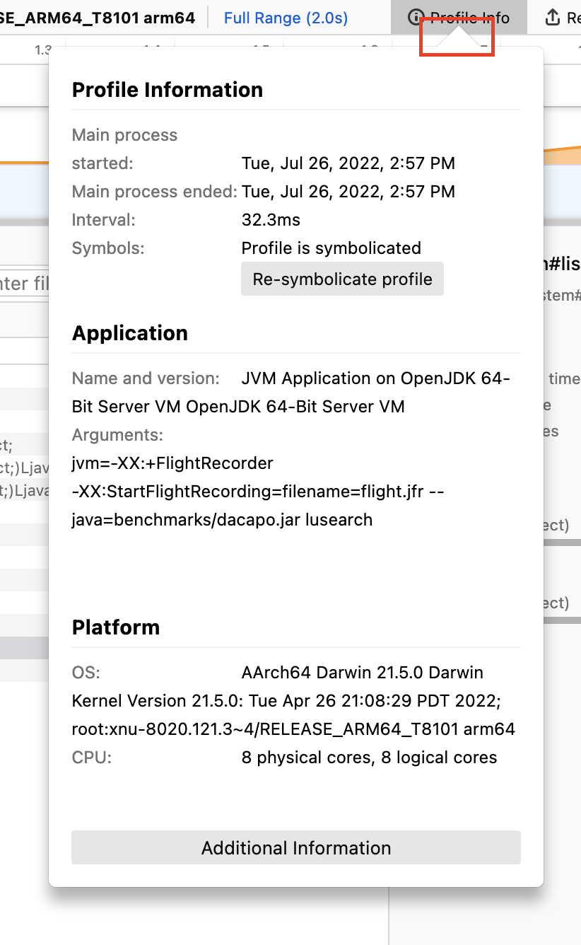
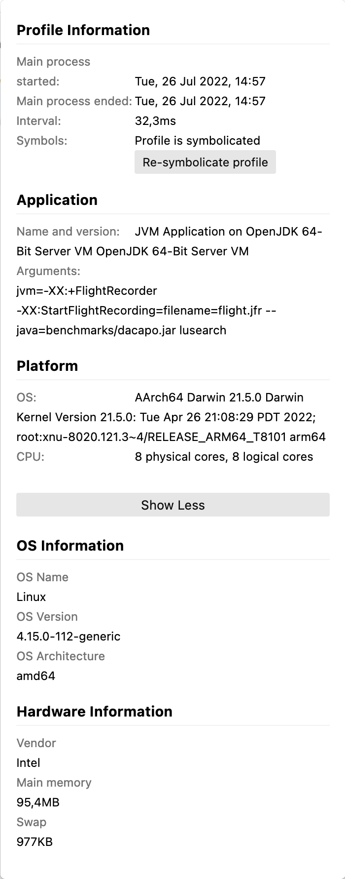
This implements a container giving more information than already provided in the "Profile Info" container (see #4209). This gives us the possibility to add more information that is related to the whole profile without cluttering the "Profile Info" container.
This adds a new "Additional Information" button:
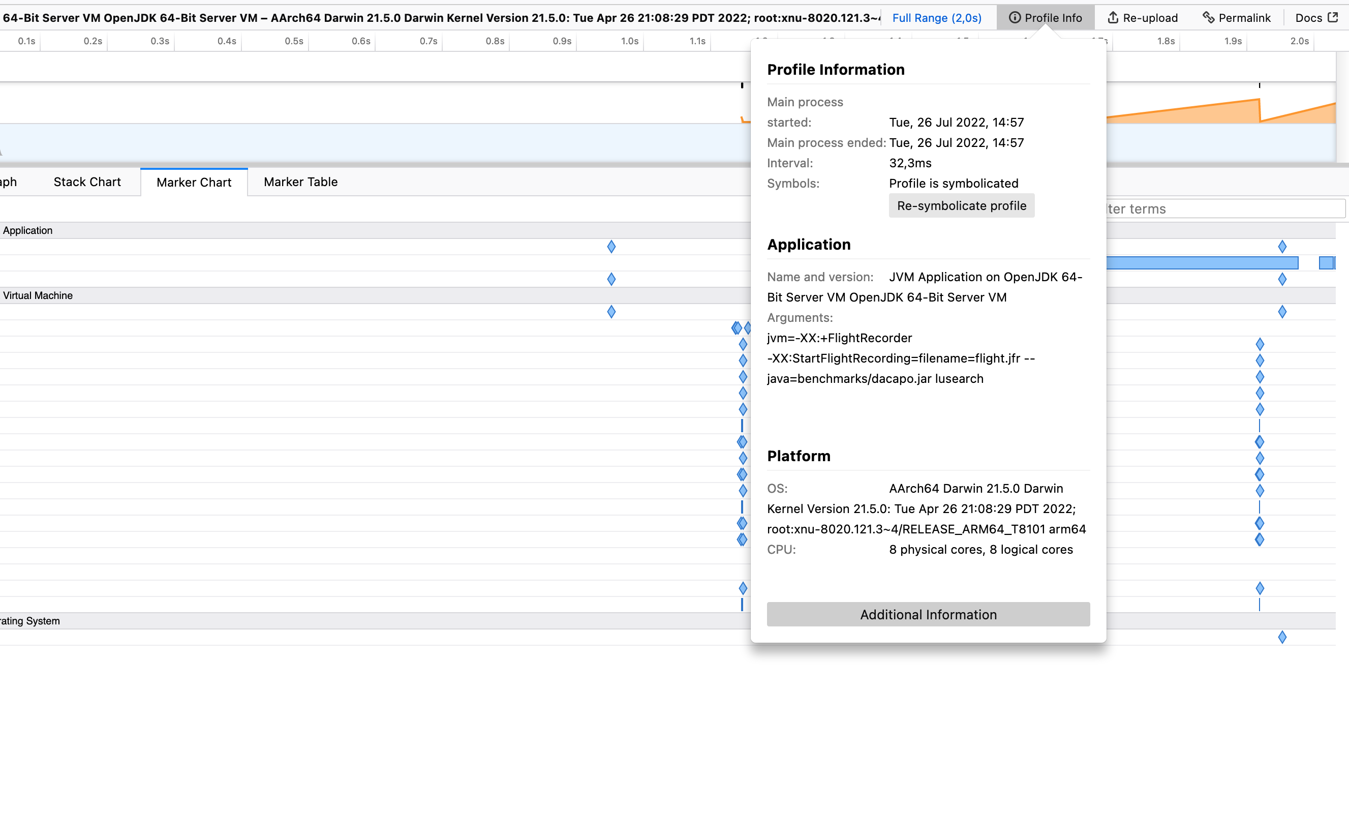
When you click on it, you see a floating container with additional information:
The information is specified in the new
extrafield in the meta section of the profile:Sample profile
Deployment Preview